

Request a demo specialized to your need.

How to design CTMS dashboards and workflows that give clinical and finance leaders a shared, real-time view of trial health.
From Disconnected Reports to a CTMS-Based Oversight Canvas
Dashboards have become the default answer to almost every oversight problem in clinical development. Yet in many organizations, CTMS screens and BI tiles still feel like passive reports, not active tools for decision-making. Clinical teams export CTMS data into spreadsheets, finance teams build separate cubes off ERP feeds, and executives receive bespoke decks that do not match what anyone sees day to day. The result is a familiar pattern: trial health becomes a matter of narrative and negotiation rather than a shared, real-time view.
THE PROBLEMStarting with the Right Question
Designing CTMS dashboards that clinical operations, finance, and executives all trust starts with a different premise. Instead of asking "What can we show?", you ask "Which questions do we need to answer reliably, every week and every month, using a single source of truth?"
- Are we where we said we would be on startup, enrollment, and data quality?
- Are we where we said we would be on budget burn, accrual coverage, and site payments?
- What risks — operational, quality, or financial — are building in this portfolio, and what are our options to respond?
Modern perspectives on trial oversight echo this shift. Dashboards are only useful when they provide real-time or near-real-time answers to questions that matter, with drill-down into specific countries, sites, and vendors. Cloudbyz CTMS and CTFM provide the raw material: structured events and financials keyed by study, country, site, and subject. The job of dashboard design is to turn that material into a small set of consistent frames that teams can rely on in every forum — from internal stand-ups to steering committees and board meetings.
DASHBOARD DESIGNDesigning for Operations, Finance, and Executives
Effective dashboards start by reflecting how different roles actually work. Each audience arrives with fundamentally different questions — and needs fundamentally different views to answer them.
"Are we on track for first-patient-in? Which countries and sites are bottlenecks? Where is quality at risk?"
"How are we tracking against budget and cash forecasts? Which drivers explain variances this month and quarter?"
"Which programs are green, amber, or red — on delivery, quality, and financial health — and why?"
A CTMS-centric design can serve all three groups if you define a small, shared set of "north-star" KPIs that can be sliced differently for each audience.
- Trial Operations: Startup readiness by country and site; enrollment versus plan; verified-visit coverage for critical-to-quality visits; deviation and query trends; eTMF health
- Finance: Budget burn, accrual coverage, and site-payment SLA performance — expressed in the same study–country–site structure CTMS uses
- Executives: Aggregated RAG tiles answering: which programs need intervention and why?
Cloudbyz makes this multi-layer design feasible because CTMS events and CTFM financials share the same backbone of entities and keys. A study-level view can show an integrated timeline with operational and financial checkpoints; clicking into a country reveals startup packs, enrollment curves, and cost curves side by side; drilling into a site exposes visit behavior, data quality, and payment timing in the same frame.
"Dashboards overloaded with gauges and micro-charts hide trends instead of surfacing them. Each tile should have one clear question attached to it."
Design Choices That Surface Trends, Not Noise
Visual design choices matter as much as metric selection. For portfolio and program views, emphasize a limited set of tiles and sparklines, each with a clear question attached: "Is enrollment on plan?" "Are we paying sites on time?" "Is budget burn explainable?"
Use consistent color and layout across studies so that users do not have to relearn the interface for each trial. Where more detail is needed — for example, to see site-level performance or visit-level quality — reserve separate pages or drill-throughs rather than cluttering the top-level canvas.
- Too many gauges and micro-charts that compete for attention and obscure trends
- Inconsistent color coding across studies, forcing users to relearn each view
- Overloaded top-level canvases that should be reserved for drill-through pages
- Metrics without attached questions — numbers without context prompt debate, not decisions
Connecting CTMS to the Broader Ecosystem
Integration is another critical dimension. CTMS dashboards are most powerful when they incorporate signals from EDC, RTSM, eTMF, and ERP instead of forcing users to pivot between tools. A dimensional model anchored in CTMS can feed dashboards with consistent facts and dimensions across connected systems.
In a Cloudbyz stack, those warehouse structures can be populated directly from CTMS, CTFM, and connected systems, allowing dashboards to ask questions like: "Where are we seeing delays between visit completion, data verification, and payment eligibility?" — without manual reconciliation.
Good dashboards are not just for viewing — they are for action. Embedding workflow cues, such as links from red tiles to CTMS work queues, tasks, or collaboration spaces, helps teams move from insight to intervention quickly. When dashboards are wired directly to the same configuration that drives processes, they become front doors into work, not just read-only reports.
If a country's startup readiness is stuck, a click should reveal which sub-milestones are late and who owns them. If a site's event-to-payable cycle time has spiked, a dive into CTFM can show whether the issue is eligibility logic, missing documentation, or banking details.
Embedding Dashboards into Decision Rhythms
Dashboards deliver value only when they are embedded into governance rhythms and evolve with the portfolio. A one-time build that nobody revisits quickly becomes wallpaper. To keep CTMS dashboards central and credible, sponsors and CROs need to define cadences, owners, and feedback loops.
Start with a monthly "clinical–finance cockpit" that uses a standard Cloudbyz-derived deck for every trial. The first pages show portfolio tiles; subsequent pages walk through each study's operational KPIs, financial KPIs, and key risk indicators. Time is not spent debating whose numbers are correct, because all views come from the same CTMS and CTFM backbone. Instead, leaders ask which drivers moved and whether responses — adding sites, adjusting recruitment strategies, renegotiating rates, changing monitoring intensity — are having the intended effects.
- Monthly: Clinical–finance cockpit review using a standard Cloudbyz-derived deck for every trial
- Quarterly: Steering committee review of patterns across programs — chronic delays, quality hot spots, payment bottlenecks
- Board/Investor: Reuse the same high-level CTMS views, adding narrative context rather than rebuilding charts in isolation
Quarterly, a steering committee can step back to review patterns across programs. Which dashboards regularly light up with the same issues — underperforming regions, chronic start-up delays, quality hot spots, payment bottlenecks? Where do CTMS and CTFM configurations or templates need to change, rather than just local workflows?
When leaders present trial status and runway for board and investor communications, they can reuse the same high-level CTMS views internal teams see every month, adding context rather than rebuilding charts in isolation. Over time, this consistency builds confidence that internal and external narratives match reality.
OWNERSHIP & TRAININGTreating Dashboards as Living Products
To keep dashboards relevant, assign product-style owners — often within a centralized clinical data or analytics team — who are responsible for gathering user feedback, adding new views when needed, and retiring metrics that no longer serve decisions.
Resist the temptation to turn the CTMS dashboard suite into an exhaustive catalog of everything the system can show. Focus instead on the handful of KPIs and drill paths that matter most for speed, quality, and financial performance. When Cloudbyz dashboards are treated as living, governed products, they evolve with the organization and remain the primary place people go to understand trial health.
"Invest in training that teaches users how to interpret CTMS visuals — not just how to click around them."
Workshops that walk through real examples — an enrollment shortfall, a budget overrun, a site-payment problem — using dashboards as the narrative spine help teams connect graphs to decisions. As familiarity grows, teams start to use dashboards proactively: CRAs track their sites' health between visits, study finance checks accrual coverage before close, and executives review tiles before portfolio councils.
For Clinical Leaders
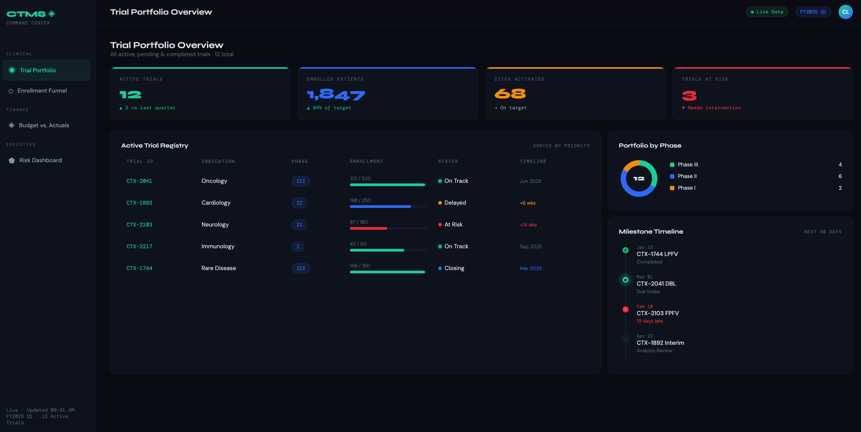
Trial Portfolio Overview — A single-pane view of all active, pending, and closed trials with status indicators, phase, therapeutic area, and milestone tracking. The goal is instant situational awareness without digging into individual trial records.
Site Performance Dashboard — Tracks enrollment rates by site, screen fail ratios, protocol deviations, and site activation timelines. Helps identify underperforming sites early so intervention can happen before timelines slip.
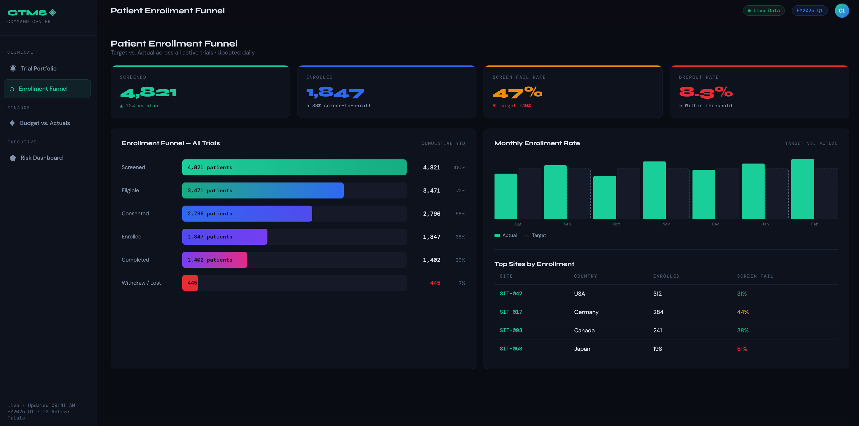
Patient Enrollment Funnel — Shows the full journey from screened → enrolled → treated → completed → dropped, with target vs. actual at each stage. Lets clinical ops teams spot drop-off points and reforecast timelines dynamically.
Regulatory & Compliance Tracker — Monitors IRB submission/approval dates, protocol amendment status, safety reporting deadlines, and audit findings. Turns compliance from a reactive scramble into a proactive workflow.
Data Quality & Query Dashboard — Surfaces open queries by site, age of query, and resolution rate. Critical for clinical data managers and monitors trying to keep databases clean ahead of DBL.
For Finance Leaders
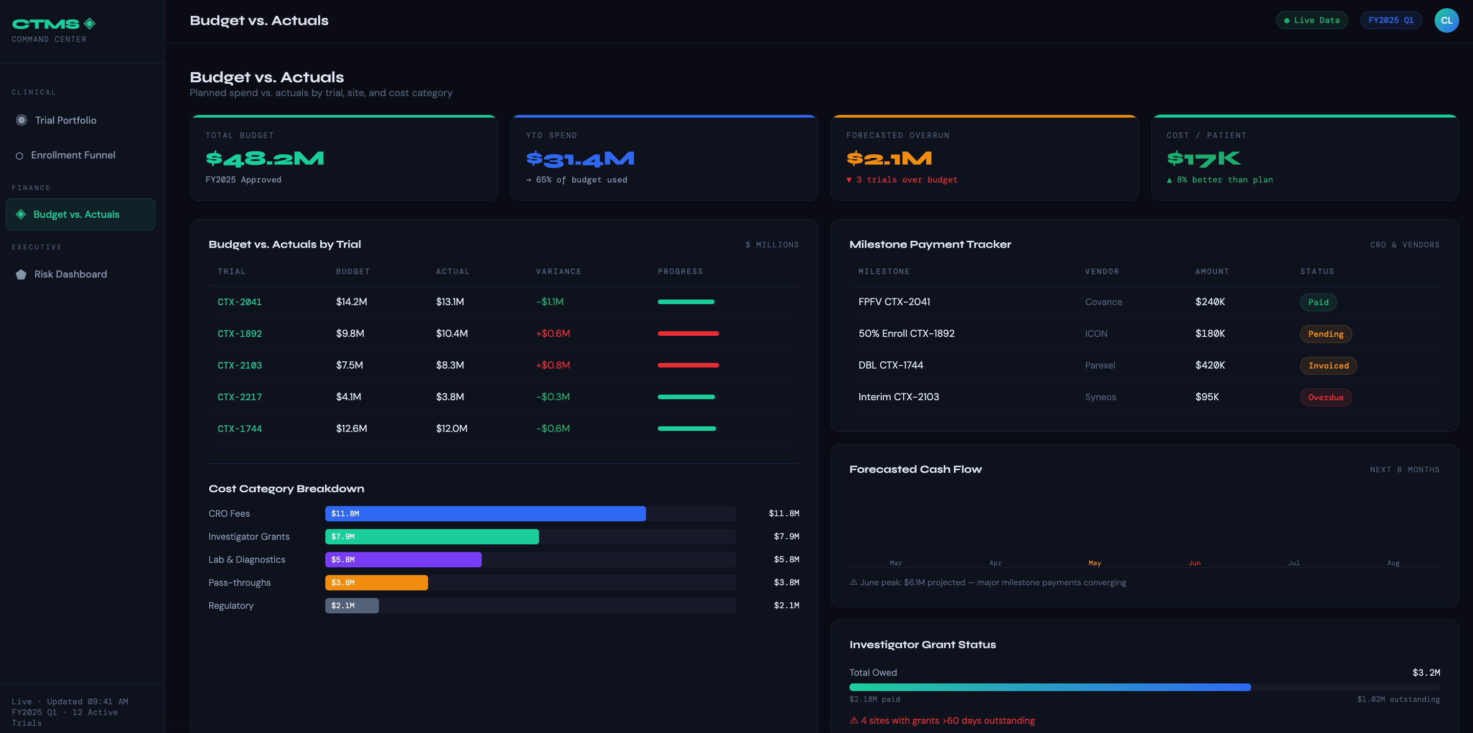
Budget vs. Actuals by Trial — Compares planned spend against actuals at the trial, site, and cost category level (CRO fees, lab costs, investigator grants, pass-throughs). The most-used dashboard in the finance toolkit.
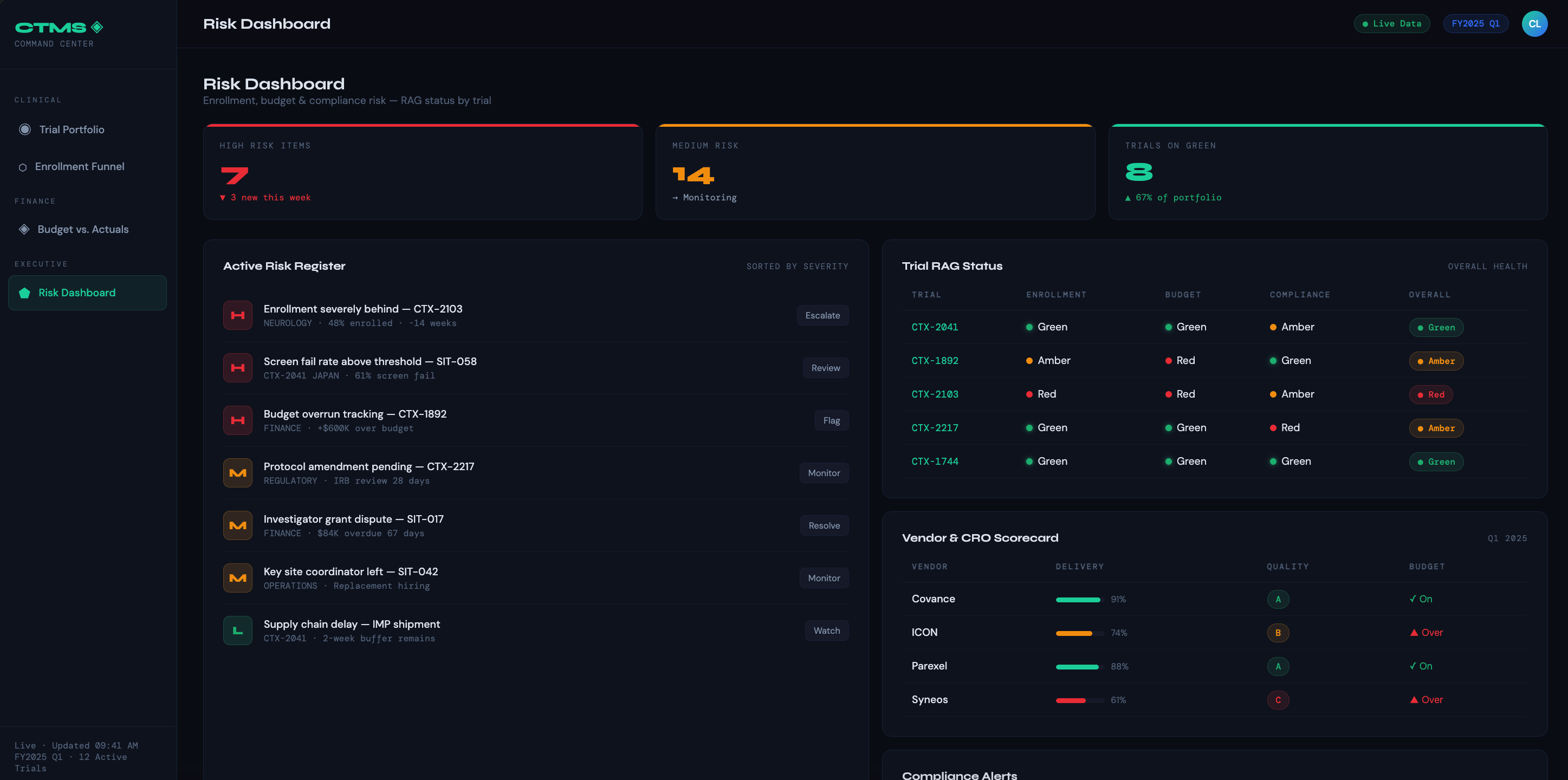
Milestone-Based Payment Tracker — Shows which enrollment or completion milestones have been hit, which invoices are pending, and what payments are overdue — by CRO, vendor, or site.
Grant & Investigator Payment Dashboard — Tracks per-patient visit payments owed vs. paid, outstanding balances by site, and reconciliation status. Prevents disputes and keeps sites motivated.
Forecasted Cash Flow — Projects monthly spend across the trial portfolio based on current enrollment rates and scheduled activities. Lets finance teams plan working capital and flag budget overruns before they materialize.
Cost Per Patient Dashboard — Breaks down fully-loaded cost per enrolled (and per completed) patient by trial and site. Invaluable for benchmarking and negotiating future contracts.
For Both Audiences (Shared Dashboards)
Trial Timeline & Critical Path — Gantt-style view of key milestones (FPFV, LPFV, DBL, CSR) with current forecast vs. baseline. Aligns clinical and finance teams on what delays actually cost.
Vendor & CRO Scorecard — Rates vendors on delivery, quality, and budget adherence. Supports governance conversations and renewal decisions with objective data.
Risk Dashboard — Aggregates enrollment risk, budget risk, and compliance risk into a single red/amber/green view per trial. Designed for executive SteerCo meetings where leaders need the signal, not the noise.
At that point, CTMS dashboards are no longer "reports" — they are the operational face of your clinical and financial control plane. The shift from passive reporting tool to active decision infrastructure is the real measure of dashboard success.
Subscribe to our Newsletter